CISCO APIC
Timeline: 12 weeks
Tools: Figma, Blueprint Library
Key tools: Figma, Blueprint, Sharepoint
Overview
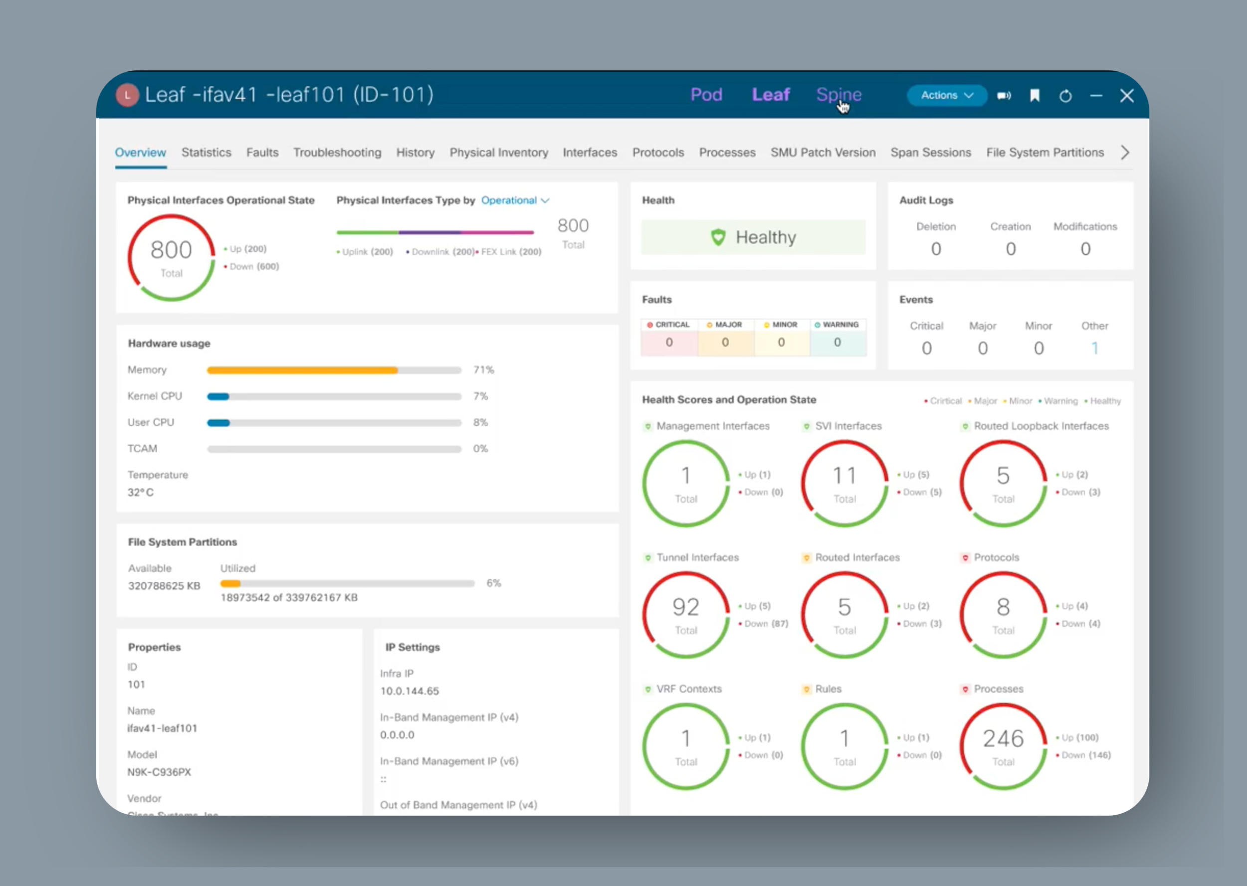
During my time at Cisco, I created 300+ screens and thousands of interactions for the Cisco Application Policy Infrastructure Controller (APIC) application using Cisco’s Blueprint UI Library and Figma. APIC Provides centralized access to all fabric information and single point automation while optimizing the application lifecycle for scale. The specific part I was working on, Fabric Inventory, allows the user to see the different parts of their fabric in the UI and monitor the status of different nodes and interfaces, which can require a lot of digging into nested layers. Therefore it was imperative that the fabric Inventory tab was organized in a way that made data easily accessible.
I learned how to integrate components into the Blueprint library, redesign data visualization, and optimize complex system navigation. I developed advanced Figma features such as variations, branching, and auto layout. I was also introduced to Blueprint, which is a library that links to Figma. Blueprint made it extremely easy to design and standardize designs across different apps, and it introduced me to the quality and standards of Cisco design.
Goals
My goal was to design the application to be consistent with the other applications and to restructure the interface for more efficiency and cohesion whilst creating a friendly and comprehensive user experience using the new Blueprint UI.
This project focused on the prototyping step of the design thinking process.
Design Thinking: Prototyping Process
Understanding context
The most challenging part of this project was designing for an extremely complex system without understanding the technical detailed functionality. There were also many instances where the old design was inconsistent. For example, tables of information that were supposedly identical had completely different properties. I had to ask myself questions like:
What properties belong here?
How do I make this consistent with other applications?
How do I structure this navigation tree without displaying the actual tree?
How do I represent this object which is nested 5 layers deep inside other objects?
This is where teamwork and communication with a domain expert became key to having a consistent and intuitive design.
Identifying The Problem: Old ui
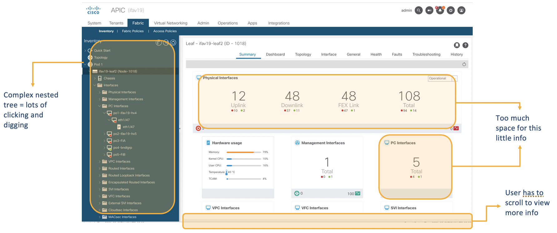
The main problem was that APIC's old UI is extremely confusing and inconsistent which leads to a frustrating experience for our customer. All other applications like Nexus Insights and Cloud APIC have already been updated with APIC being the last and largest application in need of update. Shown below are problems identified in the Summary and Protocol pages.
Identifying needs. from Cisco APIC old version
Design system to match function
Before prototyping, I had map out how my specific design would play a role in a large system. Specifically, I had to to represent a nesting system without using a nesting tree. In order to do that, I had to understand the various levels of nesting and redesign the navigation system.
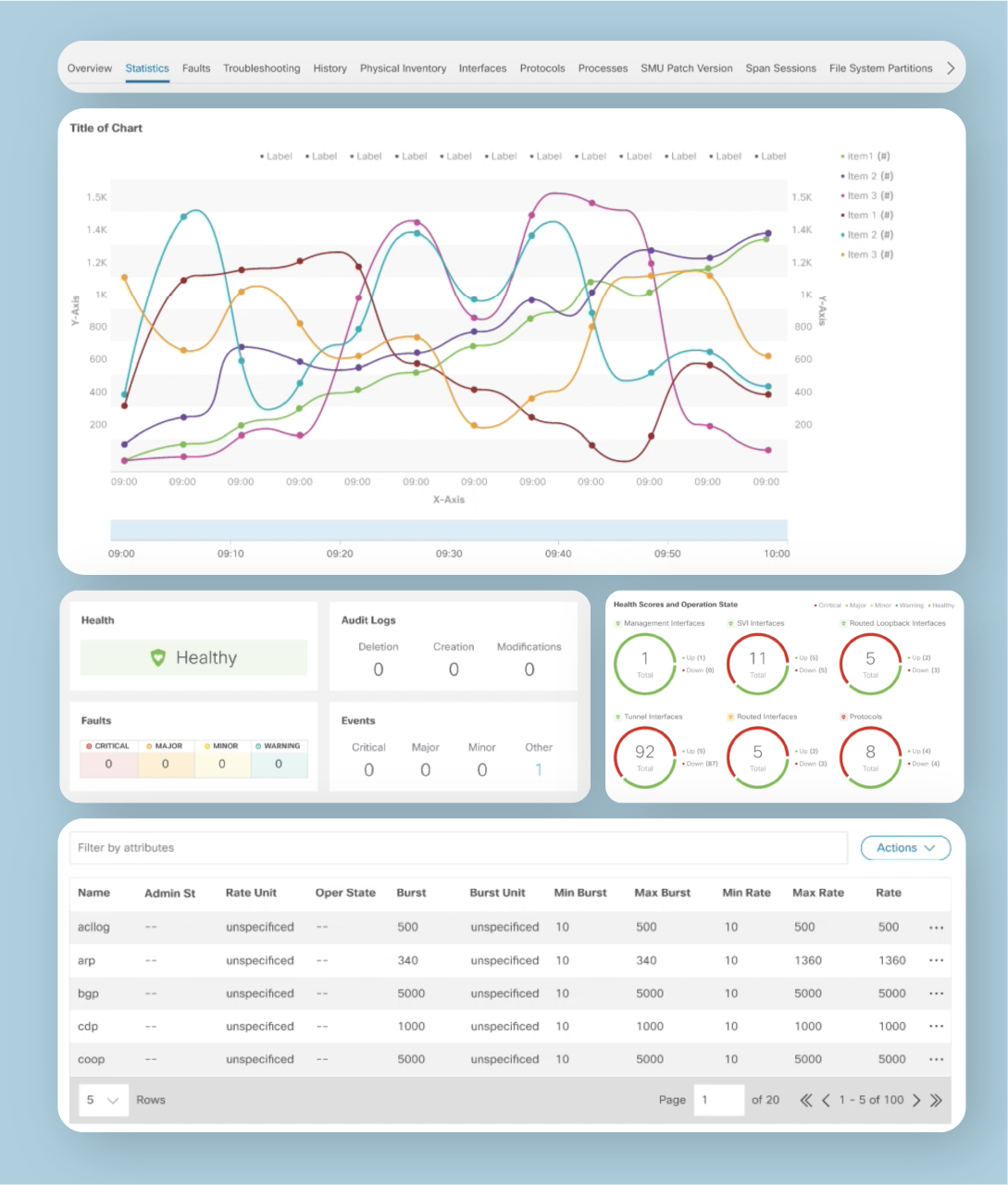
Prototyping: Updating the library
While redesigning the APIC update, I also worked on updating specific components in the library. This included redesigning the data visualization graphs, heavy tables of information, tab menus, health logs, and donut data visualizations. I created multiple iterations for the design team to choose, and implemented it into our library using the Figma branching beta feature.


